
Menus
Two surfaces show the same rows: the menu bar, a browsable map of every command, and right-click menus, what
can be done with the thing under the pointer. Both are built from the command registry, so a row’s
title, icon, chord and enabled state come from the command and never drift from the palette or the toolbar.
Reference: Editora’s ui/MainMenuBar.java (menu bar), ui/ContextMenuDismissal.java, ui/LazyContextMenu.java,
ui/RowContextMenu.java and ui/TabContextMenu.java (right-click menus), and the .menu-item and .context-menu
rules in app.css.
Look and feel
Section titled “Look and feel”Both surfaces draw their rows the same way. Absolute pixels are deliberate: a popup inherits the font of the node it
was opened from, and em would resolve against a file tree’s or an 18 px toolbar’s size (Editora’s toolbar menu once
rendered a third larger than every other menu in the app).
| Property | Value | Reference |
|---|---|---|
| Font | Inter 14 px, regular, in every row and label | .context-menu, .context-menu .menu-item .label in app.css; MainMenuBar.UI_FONT_SIZE |
| Row | 34 px high: padding 8 × 12, the same in every theme | .menu-item { -fx-padding: 8px 12px } |
| Icon column | 22 px, reserved even when the row has no glyph, so a menu with a mix stays aligned; 8 px to the title | MainMenuBar.ICON_COLUMN, rowContent |
| Icon | The command’s glyph, the same one as on the toolbar and in the palette (Save is the same floppy everywhere), filled -color-fg-muted | Icons, MenuBarIcons, .toolbar-icon |
| Title | -color-fg-default | .menu-item-title |
| Chord | Right-aligned in its own column, 11 px, in the keyboard color (-state-key, brace periwinkle); at least 18 px from the title column | .menu-item-chord, alignChordColumns |
| Submenu row | Laid out like a command row, with an invisible chord as wide as the menu’s widest, so the arrow lands at the right edge | nestedMenu, .menu-submenu |
| Card | Radius 8; shadow rgba(27,30,42,0.28), radius 16, offset Y 16 | .context-menu |
| Danger item | Text in -color-danger-fg | .menu-item.danger |
| Disabled item | The theme’s dimmed label, and the icon dimmed with it | Termina’s .menu-item:disabled .menu-icon |
| Separators | Never two in a row and none at either end: when items hide, their orphaned separators hide too | LazyContextMenu.collapseSeparators, Torrenta’s MenuSeparators |
The shadow’s offset is not cosmetic. A menu is a native window sized to its root including the effect, so a shadow
that reaches above the menu is invisible window over the bar the menu hangs from, and the pointer lands on it instead
of the next menu button. The offset must be at least the radius; Editora pins it with MenuPopupBoundsFxTest.
The menu bar
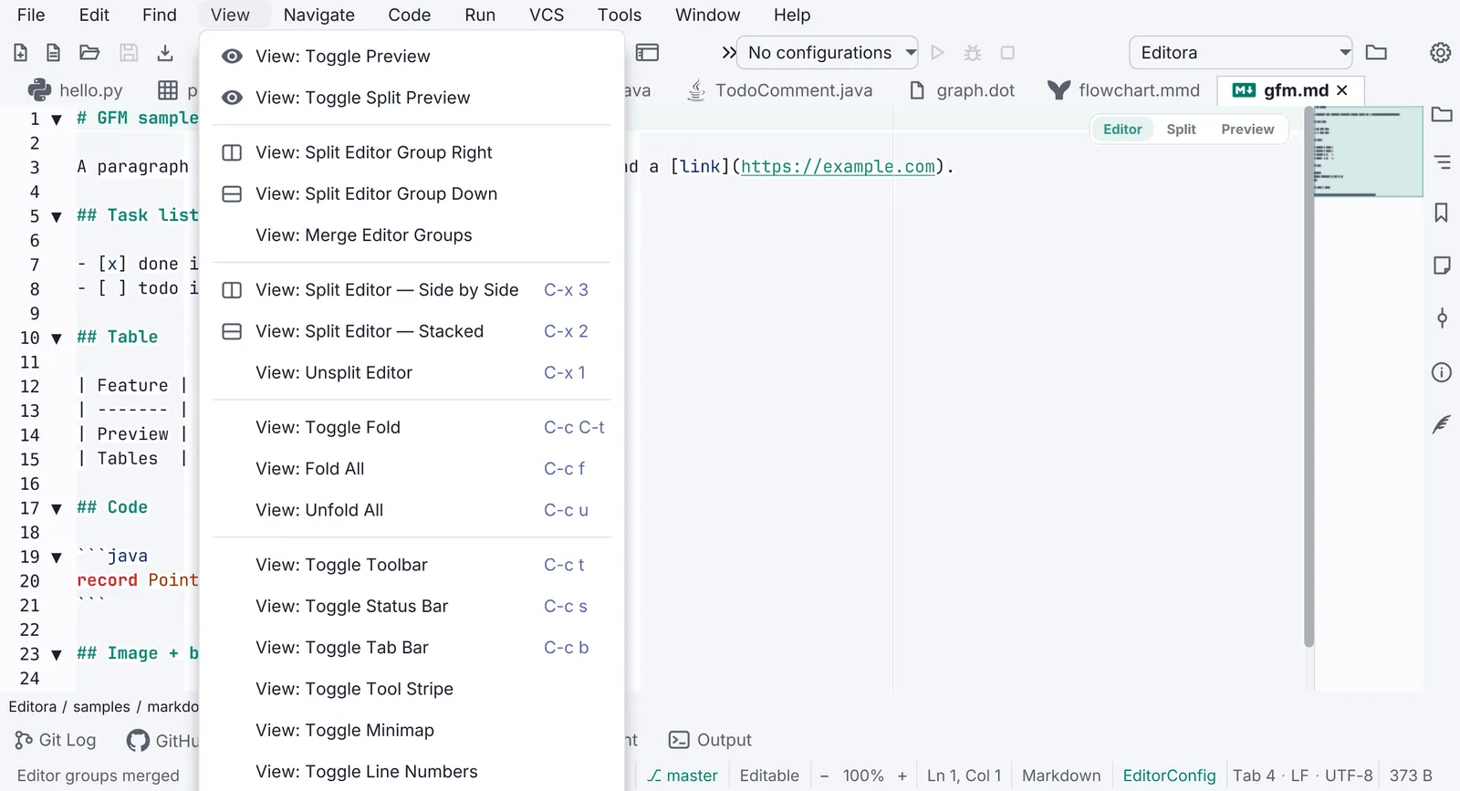
Section titled “The menu bar”- 1Menu button. Padding 3 × 10 on a bar with 4 px side insets; the bar and the toolbar share one
-color-bg-subtleband with no rule under it. - 2Icon column, 22 px. A glyph only where an existing icon genuinely depicts the command; about half of Editora's rows have one. An invented glyph is worse than none, so the rest keep an empty column of the same width.
- 3Title, 14 px Inter, the command's title with the menu's own name dropped ("Save", not "File: Save") unless two rows would then read the same.
- 4Chord column. 11 px, periwinkle, right-aligned into one column per menu (not app-wide), read from the active keymap. Drawn by the app, not a JavaFX accelerator: Emacs chords are multi-key, which a
KeyCombinationcannot express, and on macOS an accelerator would bypass the key dispatcher. - 5Unbound command. An empty chord cell, never a wrong chord. A live keymap switch rewrites every cell.
- 6Submenu row. Icon, title and an invisible chord as wide as the menu's widest, so its arrow sits at the right edge instead of halfway across.
- 7Card. Radius 8; the shadow falls below the menu (offset ≥ radius), so nothing invisible covers the bar.
Right-click menus
Section titled “Right-click menus”The mockup is an editor tab’s menu, shortened; Editora’s has twenty-five rows.
- 1Anchored at the pointer. The menu's top-left corner is the click. From the keyboard (Menu key or Shift+F10) it opens under the selected row, a quarter of the way in and never off a narrow one, or just below the caret in an editor; never in the middle of the control.
- 2Every row has an icon, the command's own. The one exception is a
CheckMenuItem, whose tick lives in the graphic column. - 3Grayed, not hidden. An action that does not apply right now (Save on an unchanged file, Reveal on an unsaved one) stays in place, dimmed. Only a row that cannot apply to this thing at all is hidden (the Git submenu on an untitled buffer).
- 4Separators group the rows; one that hiding has left alone hides too.
- 5Submenu for a family of actions (Git: stage, unstage, revert, compare, history), with its own icon.
- 6Labels follow state. Encrypt… becomes Lock File on an encrypted buffer, Pin Tab becomes Unpin Tab. Decided on every showing, not when the menu was built.
Behavior
Section titled “Behavior”| Property | Value | Reference |
|---|---|---|
| Kind | javafx.scene.control.ContextMenu, auto-hide on, hide on Escape on: a popup window, unlike the palette | TabContextMenu, ConsoleContextMenu |
| Opens at | The pointer; from the keyboard, the selected row’s bottom edge at min(width ÷ 4, 48) px in, or under the caret | RowContextMenu.anchorX, ContextMenuTarget |
| Font | Inter 14 px, pinned on .context-menu, whatever the owner’s font | app.css |
| Rows | 34 px (padding 8 × 12); icon column 22 px; glyph scaled 0.8 from a 24 dp Material path, or a 16-unit line glyph | Icons.ICON_SCALE, Icons.line |
| Card | Radius 8, shadow radius 16 at offset Y 16 | .context-menu |
| Dismissal | Any press outside the menu, in any window; the next right-click; Escape | ContextMenuDismissal, ContextMenuDismissalFxTest |
| Marker | A showing menu opened by a right-click or the Menu key carries the window property editora.rightClickMenu | ContextMenuDismissal.RIGHT_CLICK_MENU |
In the apps
Section titled “In the apps”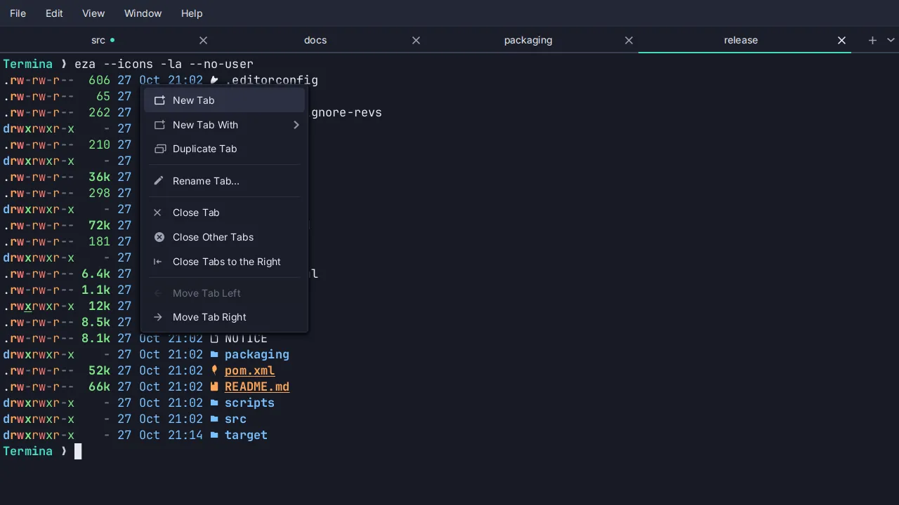
Pauta 2.0.1 · · Changelog · This page in the latest edition