Icons and color
One typeface pair, one palette, one color vocabulary and one way of drawing icons, so a tab, a status segment, a
tree row and a Settings row say the same thing in the same way in every app. Reference: Editora’s
styles/ui-font.css and ui/Fonts.java (type), styles/atlantafx-themes/editora-light.css and editora-dark.css
(the Caret & Ink palette, which Torrenta and Termina vendor verbatim), the .root block at the top of
styles/app.css (the state vocabulary), ui/Themes.java and ui/EditorThemes.java (themes), ui/Icons.java,
ui/FileIcons.java, ui/MenuBarIcons.java and editor/MenuIcons.java (icons), and StyleContrastTest, which
pins the color rules.
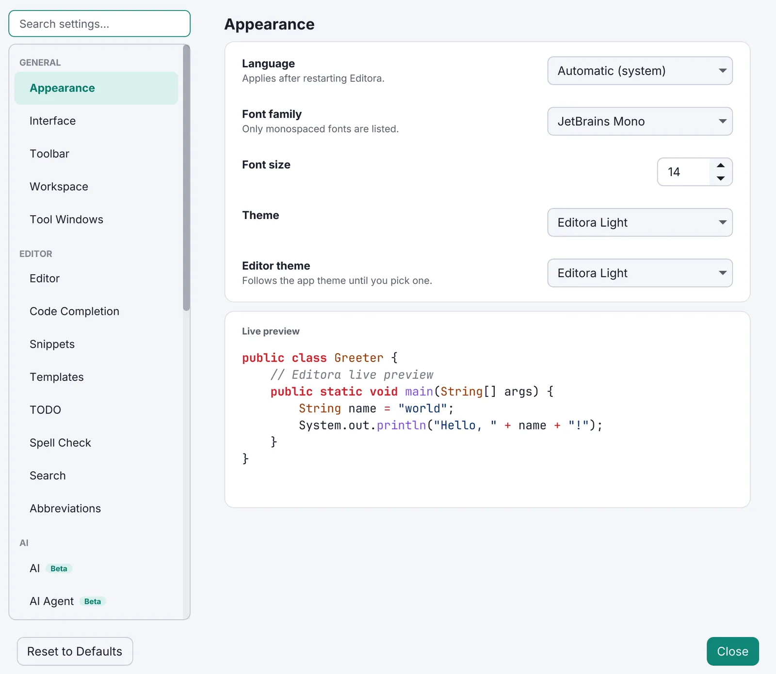
Inter speaks, JetBrains Mono works. Inter is the chrome: menus, buttons, settings, pickers, status bar. The monospace face is for text that is code or output: the editor, a terminal, the environment block in About, log timestamps.
| Property | Value | Reference |
|---|---|---|
| UI family | Inter, in four faces, bundled in the app’s resources and registered before any CSS is applied | Fonts.UI, Fonts.load(), resources/com/editora/fonts/inter/ |
| Root size | 14 px, the AtlantaFX theme’s root size; popups pin absolute pixels where an owner’s font would leak (see Menus) | MainMenuBar.UI_FONT_SIZE |
| How it is attached | A scene stylesheet (ui-font.css, one rule: .root { -fx-font-family: "Inter" }) on every window’s scene, dialogs and popups included | App.installUiFont |
| Monospace | JetBrains Mono by default; Cascadia Code, Fira Code, IBM Plex Mono and Source Code Pro are bundled as editor choices | Fonts.DEFAULT, Fonts.FAMILIES |
- MUST Attach Inter with a scene stylesheet, not a rule in the app stylesheet. Dialogs, the Settings window,
the palette, context menus and tooltips each live in a scene of their own that does not share
app.css, and a scene sheet is re-applied cleanly when the theme switches at run time (setUserAgentStylesheet). AtlantaFX neither bundles nor names Inter, and JavaFX does not fall through a font-family list, so without the sheet the whole interface renders in the platform’s “System” face. - MUST Bundle the font. Do not map the platform’s own UI font (an earlier macOS-only sheet used San Francisco, which JavaFX faux-bolds; Inter has a real bold on every platform).
- Termina and Torrenta carry the same sheet and the same four Inter faces. Modula is the stated exception: IBM Plex Mono everywhere, because every reading on a radio is a number (see Before adding a setting in Settings).
- A line of UI text is
-color-fg-default; secondary text-color-fg-muted.-color-fg-subtleis about 3:1 and is for disabled or decorative text only (StyleContrastTest.textThatMustBeReadUsesTheMutedRoleNotSubtle).
The palette: Caret & Ink
Section titled “The palette: Caret & Ink”The flagship theme pair, “Editora Light” and “Editora Dark”, is authored (not vendored) and derived from Editora’s icon: a caret teal accent, ink navy as the text in light and the surface in dark, porcelain and abyss grounds, and brace periwinkle reserved for the keyboard. Amber, red and green are semantic and never decorate.
- The theme files follow the vendored AtlantaFX community themes: a
.rootblock of-color-*tokens, then component rules that reference only those tokens. - SHOULD A new app ships the pair as its default theme. Torrenta and Termina copy
editora-light.cssandeditora-dark.cssunchanged into their ownstyles/; the palette is the family’s, not the editor’s. - Brace has no AtlantaFX role, so it is a literal: a
ladder()over-color-bg-defaultthat picks a deep ink on a light ground and a lighter periwinkle the darker the ground gets, and reads at 4.5:1 or more on every bundled theme’s default and subtle surfaces (StyleContrastTest.theKeyboardPeriwinkleReadsOnEveryBundledAppTheme).
State colors
Section titled “State colors”A color is a meaning, named once on .root and referenced everywhere. The same state wears the same color in a
tab, a status segment, a tree row, a picker and a Settings row.
| Token | Chains to | Meaning | Where it appears |
|---|---|---|---|
-state-amber | -color-warning-fg | Not durable yet | An unsaved tab, a read-only file, a narrowed view, a snapshot build |
-state-red | -color-danger-fg | Broken | Errors in the echo area and the Message Log, breakpoints, a recording |
-state-green | -color-success-fg | Verified | Found, added, passing, running |
-state-accent | -color-accent-fg | The app is offering something | An update, a link, the current branch, a selected row’s bar |
-state-olive, -state-violet | A ladder of the ground | Git only: untracked, renamed | The Project tree and tabs, the Map’s structure columns |
-state-key | A ladder of the ground | The keyboard, and nothing else | Chord chips, the menu chord column, brace matching |
-state-sel | -color-accent-subtle | The selected overlay row | The palette, pickers, the Message Log (about a 13 % accent wash) |
Each of the first four also has a -bg (the role’s -subtle) and a -hover (the role’s -muted) variant, so a
pill, a row tint and a hover state come from the same place. .state-pill is the shape (bold, radius 999, padding
1 × 8); the color variant beside it carries the meaning.
- MUST No fixed hex in a component rule. A hex suits one theme; the roles track every theme for free. A
severity or debug color that is not a state token fails
StyleContrastTest.severityAndDebugColoursComeFromTheStateTokens. - MUST Readable text uses
-color-fg-mutedor stronger, which is 4.5:1 on the default, subtle and overlay grounds in both flagship themes. Tinted text (-color-<role>-fg) reaches 4.5:1 on its own subtle fill and on both grounds. - MUST Ink on an emphasis fill is
-color-fg-emphasis, never white: white on the dark accent is 1.68:1. - MUST One focus ring,
-focus-ring: -color-accent-emphasis, drawn by the:focus-visibleblock at the end ofapp.css, at 3:1 or better on every surface (see Keyboard first). - A brand hue the theme has no role for (periwinkle, olive, violet) is a
ladder()of-color-bg-default, never a fixed pair: the old fixed light hexes read at 3.2:1 on Editora Dark. - SHOULD A pure test reads the stylesheets and does the WCAG arithmetic, as
StyleContrastTestdoes; a contrast regression is invisible in a code diff. Mirada’sAccentTestchecks that the accent reads as text on both grounds; Termina’sThemeTestkeeps every chromatic color of its terminal schemes legible.
Themes
Section titled “Themes”- MUST Light and dark, a “follow the system” choice, and a live switch without a restart (see
Window shell). The first-run default is Editora Light (
Themes.DEFAULT), which is also the fallback for a theme name the app does not know. - Editora lists 28 app themes: the Caret & Ink pair, AtlantaFX’s Primer, Nord, Cupertino and Dracula, and 21
community themes (Army, Autumn, Blacky, Blue, Browny, Fall, Navy, News, Spring, Summer, Winter, Yacht, with
light and dark variants) vendored unmodified from the MIT-licensed dlsc
atlantafx-themescollection. User themes under<config>/themes/join the list (Themes.names()). - Editor themes are separate (
EditorThemes). The flagship pair carries its own editor stylesheet; every community theme is served by oneadaptiveeditor theme whose syntax palette is expressed in the theme’s own-color-*tokens, so it follows whatever ground the theme has. - Semantic colors never decorate: a theme may change the teal, the ground and the ink, but amber still means “not durable yet”.
Every icon is an SVG path drawn in code, colored by the stylesheet so it follows the theme, and returned as a fresh node per call (a JavaFX node has one parent). There are two families, mid-migration to the UI Kit, and they are not interchangeable.
icon-line · -fx-stroketoolbar-icon · -fx-fill| Property | Line family | Filled family | Reference |
|---|---|---|---|
| Source | The UI Kit’s 16-unit outline glyphs, drawn for the kit | Material Design 24 dp single-path glyphs (Apache-2.0), plus Simple Icons brand marks (CC0) | Icons.line, Icons.of, NOTICE |
| Style class | icon-line | toolbar-icon | app.css |
| Color | -fx-stroke: -color-fg-muted, stroke width 1.3, round caps and joins, fill transparent | -fx-fill: -color-fg-muted | .icon-line, .toolbar-icon |
| Hover, disabled | -color-fg-default on hover, -color-fg-subtle disabled; every context mirrors the matching rule of the other family | The same | .button:hover .icon-line, .button:hover .toolbar-icon |
| Drawn size | 16 × 1.2 = 19.2 px (LINE_SCALE = ICON_SCALE × 24 ÷ 16) | 24 × 0.8 = 19.2 px (ICON_SCALE) | Icons |
| Used for | The chrome the kit draws: toolbar, tool stripe, tabs, and every action that has a kit glyph | Everything the kit specifies no glyph for: file types, context-menu rows, build-tool and browser brand marks | Icons, FileIcons |
- MUST One class per family on a node, never both. A line glyph is colored by its stroke, and any
X .toolbar-iconfill rule (there are dozens) would paint its outline solid. A glyph that moves family moves its CSS with it. - MUST The same action wears the same glyph wherever it is reached: Save is one floppy on the toolbar, in the
File menu and in a tab’s menu.
MenuBarIconsreusesIcons;editor/MenuIcons(the editor package may not depend onui) copies each twin’s family and path data verbatim. - MUST An icon-only control has a name: build it through
Icons.buttonorIcons.toolbarButton, which set the tooltip and the accessible text together (see Keyboard first). - SHOULD No invented glyph. A row gets an icon only where an existing glyph genuinely depicts it; a picture that does not mean the thing beside it has to be read and then discounted. The column stays reserved so a menu with a mix stays aligned (see Menus).
- File icons (
FileIcons): a pureiconKeyFor(name)resolves a file name to a key (unit-tested without the toolkit),forFileNameturns the key into a node. Brand logos from Simple Icons, category glyphs (image, archive, PDF, table, lock, JSON, settings) from Material, and the generic document glyph for anything unknown, so a new type never regresses the look. - Licenses. Every glyph set and font is credited in
NOTICE: Material Design Icons (Apache-2.0), Simple Icons (CC0; the logos stay their owners’ trademarks), Octicons and Seti UI (MIT), Inter and the monospace faces (OFL).
In the apps
Section titled “In the apps”| App | Icons | Size |
|---|---|---|
 Editora | Both families, ui/Icons, FileIcons, MenuBarIcons, editor/MenuIcons | 19.2 px on the toolbar and in menus |
 Torrenta | Both families, copied from Editora as Icons.Glyph, which knows its box and resizes with at(px); the toolbar is all line glyphs (stroke 1.5, -torrenta-icon) | 17 px toolbar, 16 px menu and tab (MENU_SIZE), 13 px sidebar |
 Termina | Material filled, ui/MenuIcons, colored by .menu-icon (-color-fg-muted; -color-fg-default focused; subtle and half opacity disabled) | 24 × 0.7 = 16.8 px, menus only |
 Mirada | Hand-drawn stroked paths on a 24-unit grid, two-unit strokes, round caps, in GNOME’s symbolic style, so nothing carries a license; .icon strokes -color-fg-default | 16 px, centered in a 16 px box |
 Modula | Glyphs: the transport symbols (tune, seek, star) as shapes, because the characters are missing from most faces and render differently on every platform | 11 px |
 nux | No in-window icons; the tray icon is rendered as a bitmap by severity (TrayIconRenderer) | Tray only |
Pauta 1.3.2 · · Changelog