
Toolbars and tooltips
A toolbar is the fast path to commands that are also in the menus and the
Command Palette: nothing lives only on it. Every button is a command, so its icon,
title and chord come from the registry and the active keymap. Reference: Editora’s ui/Icons.java (button,
toolbarButton, name), ui/ToolbarCoordinator.java (the customizable bar), ui/WindowChromeCoordinator.java
(collapseToolbarSeparators), ui/ToolWindowManager.java (the tool window stripes) and the .tool-bar,
.toolbar-button, .tool-stripe-button and .tooltip rules in app.css.
Anatomy
Section titled “Anatomy”Main.javapom.xml5
Save (C-x C-s)3
- 1Icon button, 28 px: padding 3 × 5, radius 4, no border, the glyph in
-color-fg-mutedand-color-fg-defaultunder the pointer. It has a name even though it shows none: the same string is its tooltip and its accessible text. - 2Group gap. A vertical
Separatornode whose line is transparent: its padding is what separates the groups. No drawn rule. - 3Tooltip. The command's title and its chord in the active keymap, "Save (C-x C-s)". A popup window with the menus' radius 8.
- 4Open toggle. A button whose overlay is showing (Find, the palette, a split) wears
:open: an accent-subtle fill and the glyph in the accent color. Simple mode's own button does the same while the mode is on. - 5One band. The menu bar, the toolbar and the tab strip sit on
-color-bg-subtlewith no hairline between them; spacing does the grouping. - 6Pinned tail. The project picker, About and Quit live in their own container beside the
ToolBar, so a narrow window overflows the icons (which are all in the menus too) and never the tail.
| Property | Value | Reference |
|---|---|---|
| Button | 28 px high: padding 3 × 5, radius 4, style classes button-icon flat toolbar-button; every control on the bar is pinned to 28 px, combos and menu buttons included | .toolbar-button, .tool-bar .combo-box-base |
| Bar | Padding 5 1 2 6 (asymmetric: the tab strip below adds its own inset); 18 px font for the bar’s own labels, controls inside it at 14 px; -color-bg-subtle, no rule above or below | .tool-bar, .menu-bar, .tool-bar |
| Icon | The command’s glyph, 17 px drawn (Torrenta) or a kit glyph at the toolbar scale (Editora); -color-fg-muted, -color-fg-default on hover, -color-accent-fg while :open | Icons, .toolbar-icon, .icon-line, .button:open |
| Group gap | A vertical Separator with its line transparent; its 0.75 em padding is the gap | .tool-bar .separator:vertical > .line |
| Tail | Its own container (.toolbar-tail), same insets and font as the bar, never overflowed | ToolbarOverflowFxTest |
| Tooltip | <title> (<chord>), the chord from KeymapManager.displayChord; only the title when unbound; radius 8 like the menus | ToolbarCoordinator.buildExtraButton, ToolWindowManager.tooltipFor, .tooltip |
| Stripe button | A toolbar button on the tool window rail: min 24 px, padding 9 × 5, radius 6, 8 px apart on a 30 px rail; the same muted, hover and :open colors; the bottom stripe adds a 14 px label | .tool-stripe-button, ToolWindowManager.register |
| Customize mode | The bar tinted -color-accent-subtle, a move cursor, the dragged button at 0.4 opacity, a 2 px accent insertion line on the drop target’s edge | .tool-bar.toolbar-customizing, .toolbar-drop-before |
- MUST. Every icon-only button has a name. Build it through one helper that sets the tooltip and the accessible
text from the same string (
Icons.button,Icons.name; Torrenta’s copy of both). A hand-rolled button gets the tooltip and forgets the name, which is how Editora once had seven copies of the helper drifting apart, and how a screen reader comes to announce “button”. nux sets both by hand on its ”?” button for the same reason. - MUST. Toolbar buttons stay out of the Tab order.
Icons.toolbarButtonsetsfocusTraversableto false: the command, the palette and the menus reach the action, and Tab is for the content. Termina’s search bar buttons do the same. The keyboard page has the general focus rules. - MUST. The tooltip names the command and its chord, read from the active keymap, never typed into a string:
“Save (C-x C-s)”. Editora’s catalog buttons (
ToolbarCoordinator), its stripe buttons (ToolWindowManager), Torrenta’stoolbar.withChordand Mirada’s header buttons all format it the same way. - SHOULD. Groups by spacing, not rules. Keep the
Separatornodes (their padding is the gap) and make the line transparent. Hiding a button group (Simple mode, a build tool that is not detected) runscollapseToolbarSeparators, which hides leading, trailing and doubled separators so no gap is left standing on its own, and shows them all again when nothing is hidden. - SHOULD. One chrome band. The menu bar, the toolbar and the tab strip share
-color-bg-subtleand draw no hairline between them; the breadcrumb, the bottom stripe and the status bar do the same at the bottom. Three rules within forty pixels read as clutter, not structure. - MUST. A toggle looks on while it is on. A button that opens an overlay (Find, the palette, a split) and the
Simple mode button carry the
:openpseudo-class while their state holds, so the way back out does not look like the way in. Torrenta uses:onfor Simple mode and:activefor the alternative speed limit. - MUST. The toolbar never holds the only way to an action. Every icon in the customizable cluster is also in the menus and the palette; that is what makes it safe to hide icons in a narrow window and to let the user remove them.
- MAY. A customizable toolbar. Editora’s cluster is a list of catalog ids in Settings (
toolbarLayout), sanitized on read and shared by every window. The bar’s right-click menu offers Customize Toolbar… (or Done), Configure… (the Settings page) and Restore Default. In customize mode the bar tints, buttons drag to reorder with an accent insertion line and drag off the bar to remove; Escape leaves the mode. Pinned byToolbarCustomizeModeFxTestandToolbarCustomizationFxTest. - The bar’s right-click menu is one menu, reused across right-clicks, so showing it again moves it, and
ContextMenuDismissalcloses it on a press anywhere, the toolbar included (ToolbarContextMenuDismissFxTest). The bar runs at 18 px, and a popup inherits the font of the node it was shown from; the.context-menurule that pins menus to 14 px is what keeps this menu the size of every other (ToolbarMenuFontFxTest). See Menus. - Tool window stripes are toolbars. A stripe button is built like a toolbar button: tooltip with the chord,
accessible text bound to the window’s title, a right-click menu with Open in Split and Hide. The right stripe’s
first icon lines up with the editor’s first line of text, not with the tab strip
(
ToolWindowStripeAlignmentFxTest).
In the apps
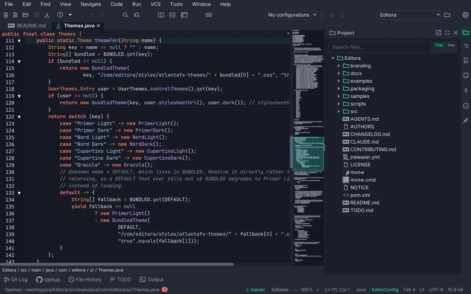
Section titled “In the apps”- Editora: the customizable cluster, the pinned tail, the stripes.
- Torrenta: the same
Icons.toolbarButtonandIcons.name, 32 px buttons, Simple mode as:on; its separators still draw a line. - Mirada: a
HeaderBartitle bar with flat icon buttons around the file name, stroked symbolic icons in the text color, tooltips of the form “label (chord)”; no accessible names on the buttons. - Termina: no main toolbar (its tabs are in the title bar); the search bar’s buttons are 24 × 22 flat icons with tooltips, out of the Tab order.
Pauta 1.3.2 · · Changelog