
Tabs and tool panels
A window shows its documents in a tab strip and its tools in panels docked beside or under them. Both are
driven by commands, both remember their state, and both draw their chrome as one band with the toolbar, not as boxes
inside boxes. Reference: Editora’s ui/TabHeaders.java (the tab header), ui/ClosedTabs.java, ui/Switcher.java,
ui/ToolWindowManager.java, ui/ToolWindowPanel.java and the .tab-pane, .tool-stripe and .tool-window
rules in app.css.
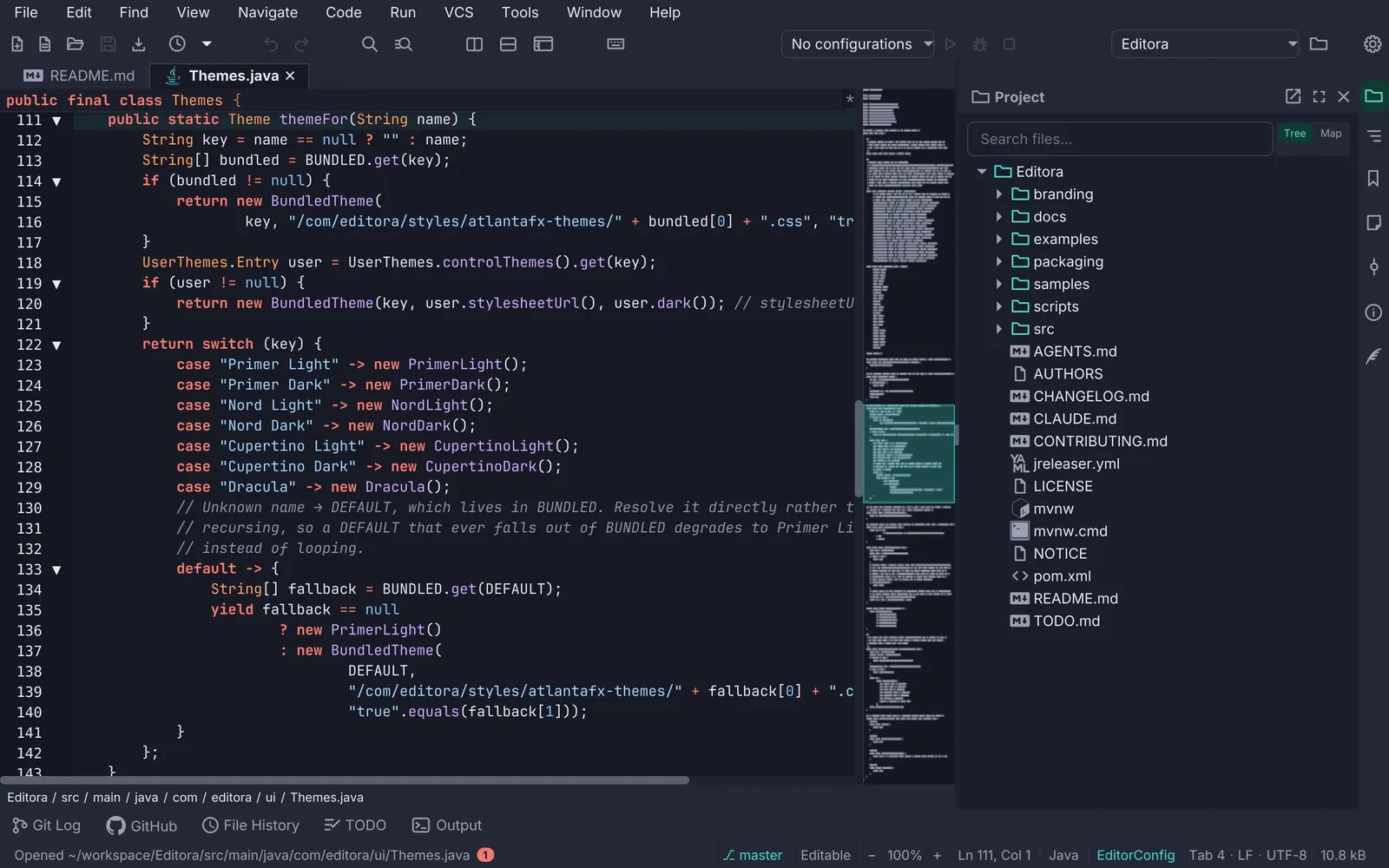
- 1Active tab. Its fill is the editor's own surface (
-editor-surface) with a border on three sides and none at the bottom, so the tab opens into the editor instead of sitting on it. Title bold in-color-fg-default; the file-type glyph tints accent. - 2Unsaved tab. A
•before the name, amber (-state-amber, "not durable yet") and italic. Amber outranks the Git-status color: "you have not saved this" matters more than "this differs from HEAD". - 3Pinned tab. A pin glyph and a bold title, kept at the front of the strip in pin order. Every bulk close (Others, All, Unmodified, Left, Right) skips it.
- 4Read-only tab. Muted and italic, echoing the status bar's Read-Only segment.
- 5Drag to reorder. The header is the drag handle and a snapshot of the whole tab follows the pointer; the dragged tab dims to 40 % and a 2 px accent line marks the edge it would land on (left half of a tab: before it; right half: after).
- 6Tool stripe. A 30 px rail of icon buttons, one per tool window, 8 px apart, on the subtle ground with no drawn edge. The open window's button is tinted; the one holding keyboard focus is tinted stronger. The first icon lines up with the editor's first line of text, not with the tab strip.
- 7Panel header. The window's glyph and title (14 px bold, muted) with float, maximize and close; the same size and glyph as its stripe button, so the two name the same thing. On the subtle ground, with no rule under it; when the panel holds focus the band tints accent-subtle and the title turns accent.
- 8The divider is the edge. The panel draws no frame: the SplitPane divider between it and the editor is the real, grabbable edge, and a hairline beside it would only double it. Its position is remembered.
- 9Bottom stripe. Its buttons carry a 14 px label beside the glyph, side by side; the open one is accent and bold.
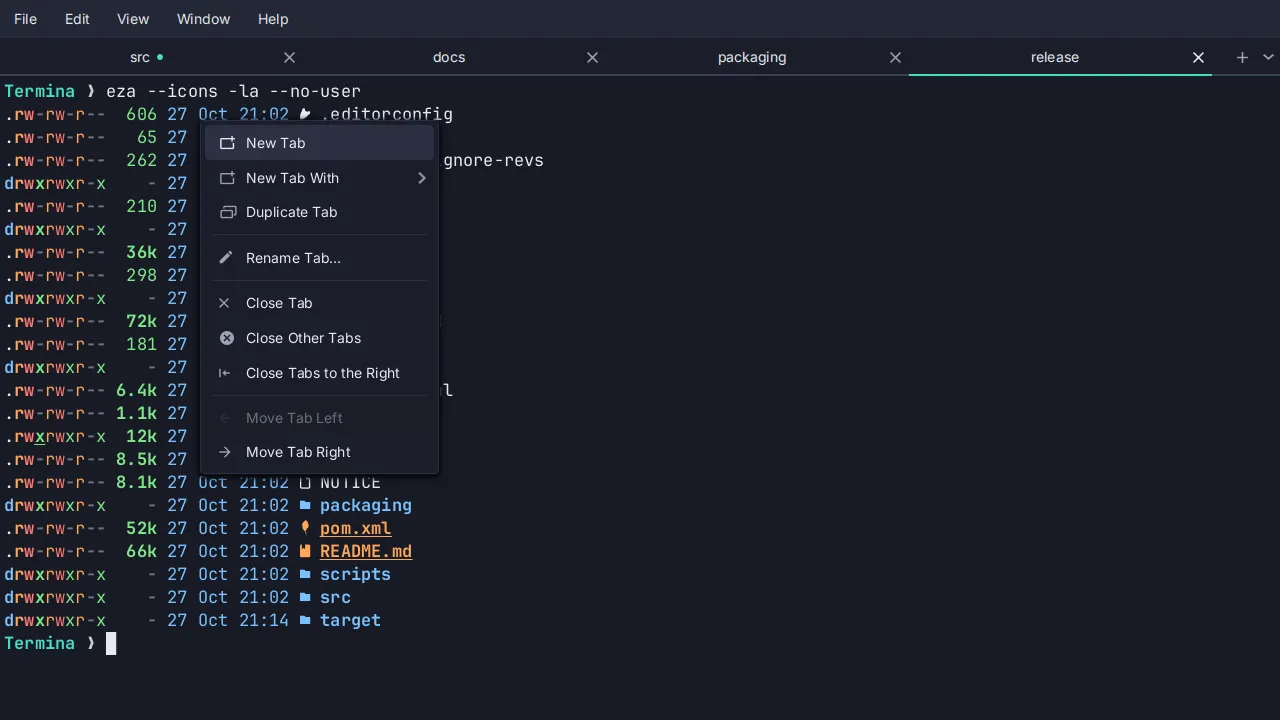
- MUST Every tab operation is a command, so it has a chord, a palette entry and a menu row: close, close others,
close all, close unmodified, close to the left and right, pin, reopen closed, next and previous. The tab’s
right-click menu lists them (
TabContextMenu). - MUST. The header is the title. The Tab’s own text stays empty; a graphic header carries the file-type glyph,
the markers and the title in a
.tab-titlelabel, which is what makes it a drag handle and lets each state set its own color (TabHeaders). The tooltip is the full path. - MUST. Bulk close skips pinned tabs.
closeOtherTabs,closeAllTabs,closeUnmodifiedTabsandeligibleToLeft/eligibleToRightall filter on the pinned set; a pinned tab cannot be closed by accident. Pinning moves the tab to the end of the pinned group, unpinning to just after it (togglePin,moveToPinBoundary). - MUST. Reopen Closed Tab.
ClosedTabskeeps the files whose tabs this window closed, newest first, bounded to twenty, a file listed once; reopening restores the caret. Termina brings back the tab (its shells, their directories, the pane arrangement, the names the user gave them, its place in the strip) and not the scrollback, because the process is gone and pretending otherwise would be worse than saying so.C-S-tin the CUA keymap; TerminaCtrl+Shift+Z,Cmd+Zon macOS. - Drag to reorder with the feedback above (
TabHeaders.enableTabDrag; TerminainstallTabDragand the pureTabReorder.insertIndex). In Termina a double-click on a tab renames it, and a pane dragged onto a tab joins it (the whole header outlined,tab-drop-into). - Git status on the tab in the Project tree’s colors: modified accent, added green, untracked olive, renamed
violet, deleted muted, conflict red (
TabGitStatus). A read-only tab still shows it; an unsaved one shows amber. - Switcher.
C-x C-b(Emacs) opens an IntelliJ-style list of the open files in tab order:C-n/C-por the arrows move, Enter or releasing Ctrl activates,C-gor Esc cancels,C-dor Backspace closes the highlighted file. Its width is fixed to the longest path on each open so it never resizes while you move (Switcher). - The window title names the file, the project and the app, with a
•prefix for an unsaved file. - Tabs in the title bar SHOULD through JavaFX 27’s
HeaderBar; see Window shell. The tab bar can be hidden by a command (view.toggleTabBar,.tab-pane.no-tab-header).
Tool panels
Section titled “Tool panels”- MUST. A command toggles each panel (
tool.<id>:M-1…M-0in the Emacs keymap for ten of them), and the stripe button is the same command with a glyph. The panel’s content is built on first use. - MUST. State is restored. Which windows are open, on which side, in what order, hidden or shown, floating, and
every divider position go to
workspace-state.jsonand come back on the next launch (ToolWindowManager). - Three sides, two windows each. Left, right and bottom stripes (
ToolWindow.Side); a side holds at most two windows stacked (Project over Structure, two consoles along the bottom), because “past that a side stops being a dock and becomes a list of slivers” (MAX_PER_SIDE). - Re-dock by dragging the stripe button to another stripe, with the same dim-and-accent-line feedback as a tab;
an empty stripe appears as a dashed accent drop zone for the duration of the drag (
ToolWindowDock). - Float, maximize, resize and close from the keyboard:
view.maximizeToolWindow(C-x f),view.closeFocusedToolWindow(C-x 0), the resize commands (C-x S-.,C-x S-,,C-x S-6). At most one window is maximized at a time. - Focus comes back. Closing the panel that holds keyboard focus returns it to where it was in the editor
(
focusEditor, a weak reference to the last editor focus owner). - Hidden is not unavailable. The user’s show/hide choice for a stripe button is kept apart from a context-driven
hide (the Commit window outside a Git repository), so the second never clobbers the first (
ToolWindowVisibility). - A bottom window that is unusable at the default height asks for more on its first open
(
setFirstOpenShare); the user’s own size wins afterwards. A stripe button badges a spinner while its window has something under way (busy). - Panels follow the active document where they should: the Git UI follows the active tab’s repository
(
GitPathScope), the status bar’s environment segment the active.httpfile, Local History the file whose tab menu opened it.
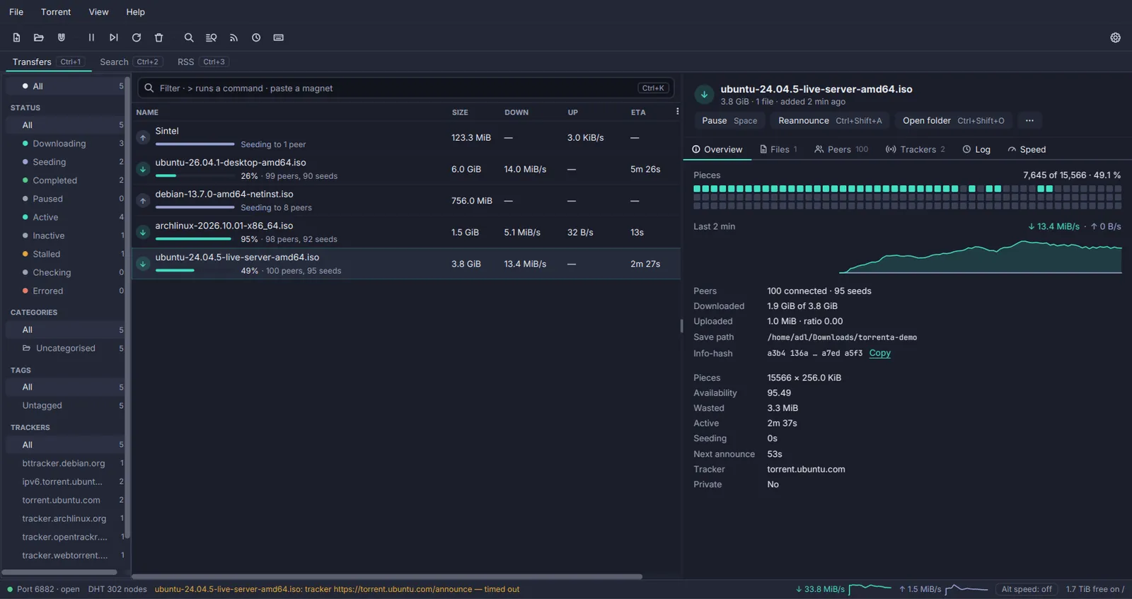
The other apps dock their panels the same way without a stripe. Torrenta’s filter sidebar sits down the left or
the right of the list or nowhere, kept as two settings keys so hiding it keeps its side (SidebarPlace); its inner
edge drags to resize within readable bounds and a double-click resets it (SidebarWidth); the detail pane docks
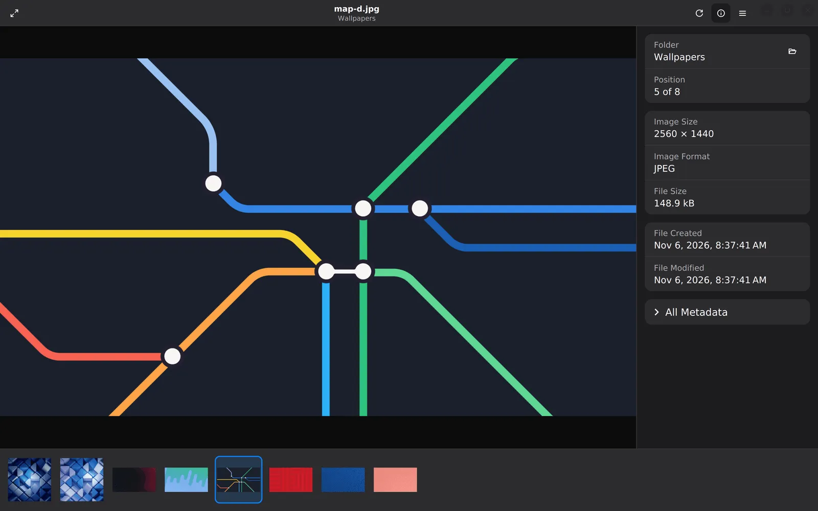
under the list in two columns or beside it in one, from the View menu (DetailPane). Mirada’s info panel opens on
the right and its thumbnail strip along the bottom or down the left side, each closed until its command asks for it
(ThumbnailStrip.place). Termina splits a tab into panes instead: a pane is picked up with a drag while
Ctrl+Alt+Shift (Cmd+Option+Shift on macOS) is held, since every smaller chord is spoken for (PaneDrag), and a
maximized pane wears a “Pane 2 of 3” badge so the others are known to still be there.
| Property | Value | Reference |
|---|---|---|
| Tab strip | -color-bg-subtle, padding 3 10 0 10, tabs bottom-aligned so the active one touches the editor; no bottom rule | .tab-pane > .tab-header-area |
| Tab | Transparent, square corners, padding 2 11 3 11; hover -color-bg-inset | .headers-region > .tab |
| Active tab | Two background layers: -color-border-default outside, -editor-surface inset 1 1 0 1; title bold -color-fg-default; glyph -color-accent-fg | .tab:selected |
| Title | Inter 14 px, -color-fg-muted, in a graphic label; the full path as tooltip | .tab .tab-title, TabHeaders.tooltip |
| Unsaved | • prefix, -state-amber, italic | .tab-header.dirty .tab-title |
| Pinned | Icons.pin() in the header, bold; first in the strip | .tab-header.pinned, togglePin |
| Read-only | -color-fg-muted, italic | .tab-header.read-only |
| Drag | Dragged header at 0.4 opacity; 2 px -color-accent-emphasis on the landing edge | .tab-dragging, .tab-drop-before, .tab-drop-after |
| Closed tabs | Twenty, newest first, one entry per file, with the caret | ClosedTabs.DEFAULT_CAPACITY |
| Switcher | 26 px rows, 12 visible, width fixed per open | Switcher.CELL_HEIGHT, MAX_VISIBLE |
| Tool stripe | 30 px wide, -color-bg-subtle, 8 px spacing, no edge; buttons min 24, padding 9 5, radius 6 | .tool-stripe, .tool-stripe-button |
| Stripe states | Open: -color-accent-subtle fill, accent glyph. Focused window: -state-accent-hover | :open, :tw-active |
| Bottom stripe | Label 14 px beside the glyph, padding 3 8; open = accent, bold | .tool-stripe-horizontal .tool-stripe-button |
| Panel | -color-bg-subtle ground, radius 0 0 8 8, no border | .tool-window |
| Panel header | Padding 6 6 6 12, radius 7 7 0 0, no rule under it; title 14 px bold muted with the window’s glyph; active: -color-accent-subtle band, accent title | .tool-window-header, .tool-window:active |
| Panel content | -color-bg-default, padding 8; its tree or list draws no frame of its own | .tool-window-content |
| Per side | Two windows at most, stacked in an inner SplitPane | MAX_PER_SIDE |
| Persisted | Open state, sides, order, visibility, floating windows, divider positions | WorkspaceState in workspace-state.json |
Pauta 1.3.2 · · Changelog